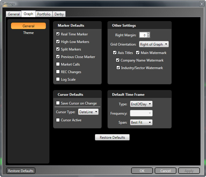
Accessing the Default Graph Tab:
Click the Options Icon (wrench) located in the upper right corner of the main screen or on the Graphs tab.
Click the 'Graphs' tab on the Settings window that appears.

Default Time Frame:
The Default Time Frame section allows you to customize the type, frequency, and time span of your default graph.
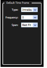
Type will allow you to select Intraday, End of Day, End of Week, or Weekly data as your initial graph type.
Intraday: displays tick-by-tick information
End of Day: displays the closing information for the security
End of Week: displays information from the last trading day of the week
Weekly: displays information from the beginning through the end of each week.
By default, Intraday data will be selected. To change the selection, click the drop down arrow beside 'Type'. Click 'Apply Changes' when your selections are complete.
Frequency is only available for Intraday data, and will allow you to select the number of minutes used to form each candlestick on the chart. By default, 1 minute bars will be selected. Click the drop down arrow next to the selection box to select a different time frame. Click 'Apply Changes' when your selections are complete.
Span is available for all periods and will allow you to choose the amount of information on the chart. In addition to numerous time frames, the Best fit selection will display the optimal time frame for your screen resolution. Current day will only display information from the current day's open forward, while choosing 1 day, will display 24 hours of information. By default, 1 day is selected. Click the drop down arrow next to the selection box to select a different time frame. Click 'Apply Changes' when your selections are complete.
Other Settings:
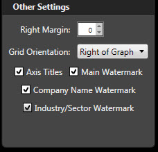
Other Settings will allow you to enable multiple graph tabs, as well as change several display aspects that affect margins, menu orientation, and graph labels.
 ,
,
Right Margin will indent the right hand side of the chart. Click the up arrow to increase the right margin, and the down arrow to decrease it. The default margins are set to 0 so the graph will be displayed from edge to edge. Click 'Apply Changes' when your selections are complete.
Grid Orientation will change whether the Parameter List is displayed on the right or the left side of the graph. The default display is set to the right side. To change, use the drop down arrow. The Parameter List can be completely hidden at anytime by using the show/hide arrows. Click 'Apply Changes' when your selections are complete.
Main Watermark is the ticker symbol that is displayed in the background of each chart. This setting is already selected by default. To hide the watermark, un-check the selection box next to Main Watermark. Click 'Apply Changes' when your selections are complete.
Company Name Watermark is the security name that is displayed in the background of each chart. This setting is already selected by default. To hide the watermark, un-check the selection box next to Company Name Watermark. Click 'Apply Changes' when your selections are complete.
Industry/Sector Watermark is the name of the industry group and sector that is displayed in the background of each chart. This setting is already selected by default. To hide the watermark, un-check the selection box next to Company Name Watermark. Click 'Apply Changes' when your selections are complete.
Axis Titles label the parameters displayed on each section of the chart. For example, Price, RT, and Volume are all displayed in separate sections of the chart and the axis title would be located at the top left of each section. This setting is already selected by default. To hide the axis titles, un-check the selection box next to Axis Titles. Click 'Apply Changes' when your selections are complete.
Cursor Defaults:
Cursor Defaults allow you to choose the type of cursor that is displayed on your chart. By default, no cursor is selected as the default. You may set the cursor defaults, or choose your cursor manually from the graphing toolbar.
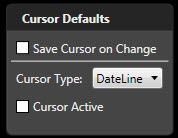
Save Cursor on Change will remember and save the last cursor manually selected, and use this cursor on successive charts. Check the selection box next to Save Cursor on Change to use this option. Click 'Apply" when your selections are complete.
Cursor Type is a drop down selection for all the cursors available in VectorVest Realtime. This selection is only available when the Active selection box is checked. There are many cursor types available to choose from:
Crosshair Cursor: Displays information from both the vertical and horizontal axis of the chart. The data displayed will be for the close of each bar. This is a dynamic cursor that will follow the motions of your mouse.
Horizontal Cursor: Only displays information from the horizontal axis of the chart. This is a dynamic cursor that will follow the motions of your mouse.
Vertical Cursor: Only displays information from the vertical axis of the chart. This is a dynamic cursor that will follow the motions of your mouse.
DateLine Cursor: Displays information in the Parameter List. This is a static cursor. Left click on the data point to display the information for the date or time selected.
Cursor Active will enable you to choose a single default cursor that will appear on each new graph. This selection is not available when Save Cursor on Change is already selected. To enable this selection, check the selection box next to Active and use the drop down arrow next to Cursor Type to make your selection. Click 'Apply' when your selections are complete.
Graph Theme:
Graph Themes will allow you to make changes to the colors displayed on several areas of the graph.
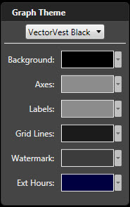
Graph Theme will allow you to select a pre-designed theme from the drop down list. There are three themes to choose from: Custom, Classic White, and VectorVest Black. VectorVest Black is the default choice. Selecting the Classic White theme will change the color scheme to a traditional white background.
You may also change the color of the individual components of the graph screen, which will result in a Custom Theme. These components are listed below the themes, and include: Background, Axes, Labels, Grid Lines, Watermark, Extended Hours, Market Call Up, and Market Call Down. Each of these can be changed by clicking the drop down arrow to the right of the current color and using the color chart to select your new choice. Click 'Apply' when your selections are complete.
Restore Defaults:
You may restore the original default graph selections and colors by clicking the 'Restore Defaults' button located at the bottom of each section of the Settings Window.